
Design Study
SmileCare Dental — concept clinic redesign
A deliberately dated “before” page and a redesigned clinic site with WhatsApp appointment requests.
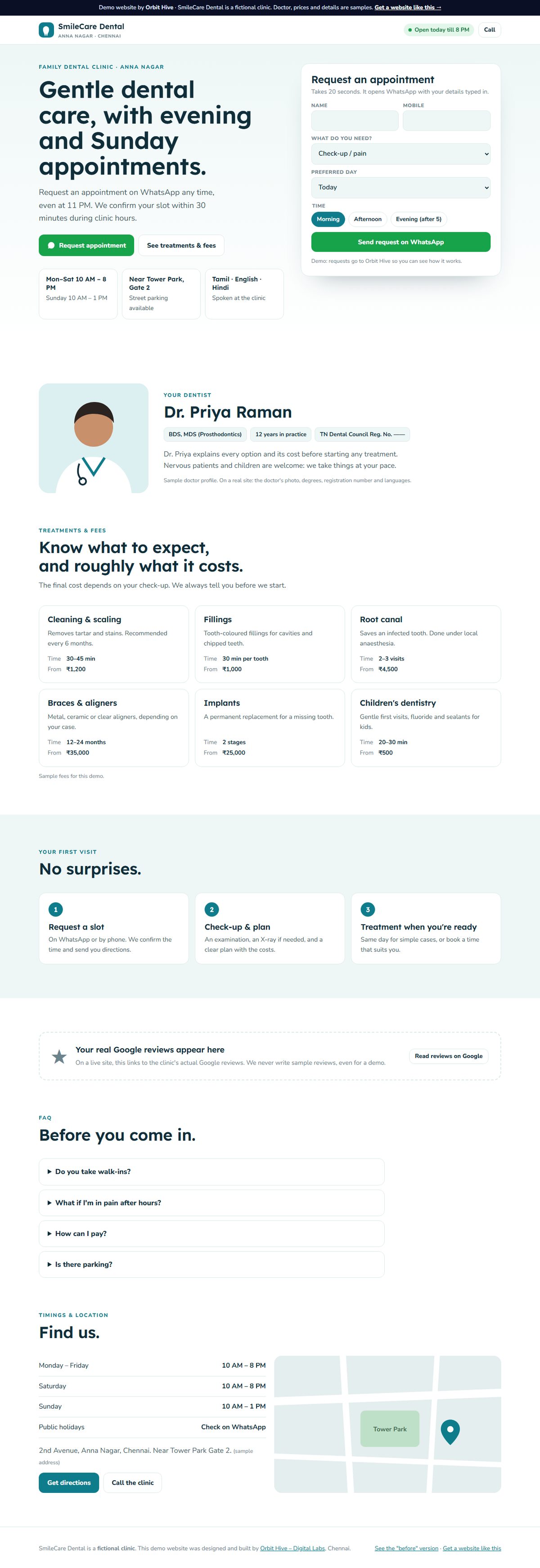
Design Study Not a client project. Shown to demonstrate approach and craft.
Context
Many small clinic websites were built years ago: tiny text, no mobile layout, a phone number you can’t tap and timings hidden in the footer.
The problem
Patients searching on their phones can’t quickly see timings, treatments or how to book, so they call, or go elsewhere.
Objective
Show, side by side, how structure and a clear contact path change the experience. Both the “before” and the “after” are concepts.
Role
Design study by Orbit Hive, with both versions built for comparison.
Constraints
Fictional clinic and doctor. Sample fees. No real patient data. Reviews are shown as a placeholder, never invented.
Approach
- Timings, location and languages visible in the first screen
- An appointment request that goes to WhatsApp with the details filled in
- Treatments explained in plain words, with typical duration
- A sticky mobile bar for calling or requesting an appointment
Technical notes
Static HTML/CSS/JS. The appointment request uses a WhatsApp deep link; a production version could add a booking calendar and reminders.
Outcome
No measured outcome to report. This is a design study, not a client deployment. We only publish results we have actually measured.
What we learned
Most of the improvement comes from putting existing information in the right place, not from adding features.
Next-step ideas
Add a real booking calendar with automatic reminders, and a reviews block that links to genuine Google reviews.
More work
Keep exploring
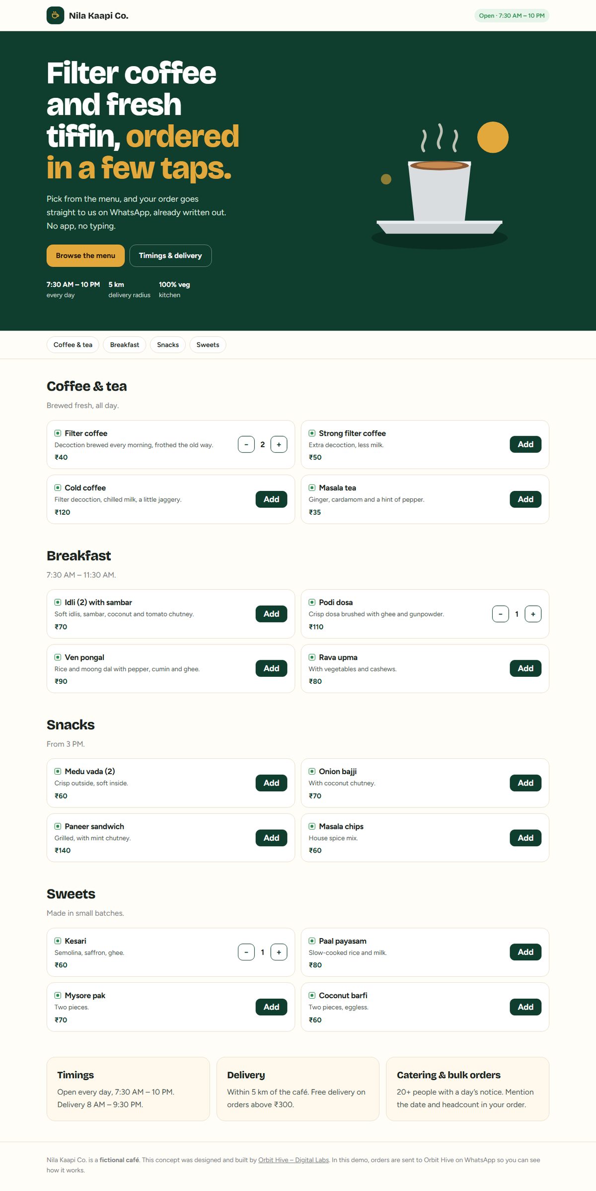 Concept Website
Nila Kaapi Co. — café menu with WhatsApp ordering
A mobile-first menu where customers build an order and send it straight to the café on WhatsApp.
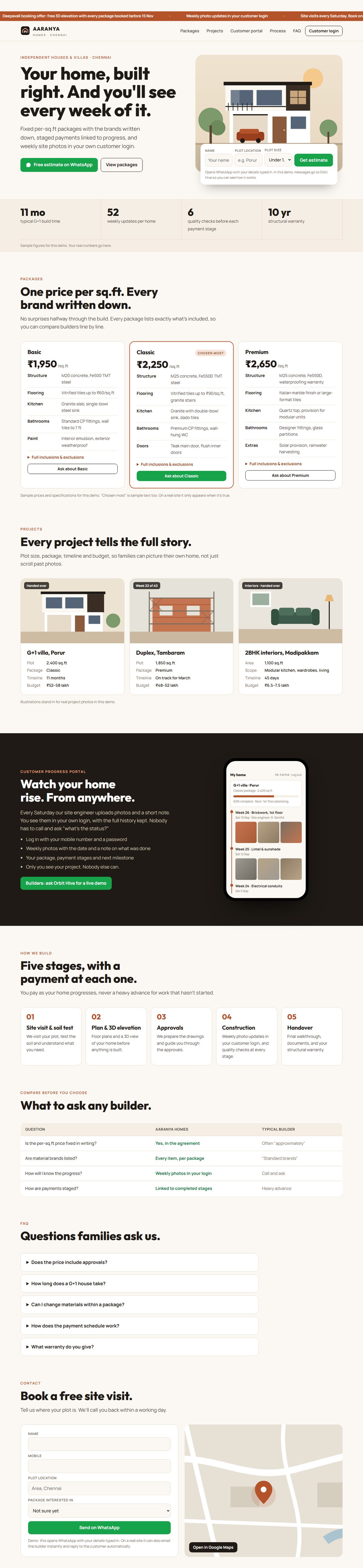 Concept Website
Aaranya Homes — builder website with a customer progress portal
Package comparison, project stories and a portal where home buyers see weekly construction photos.
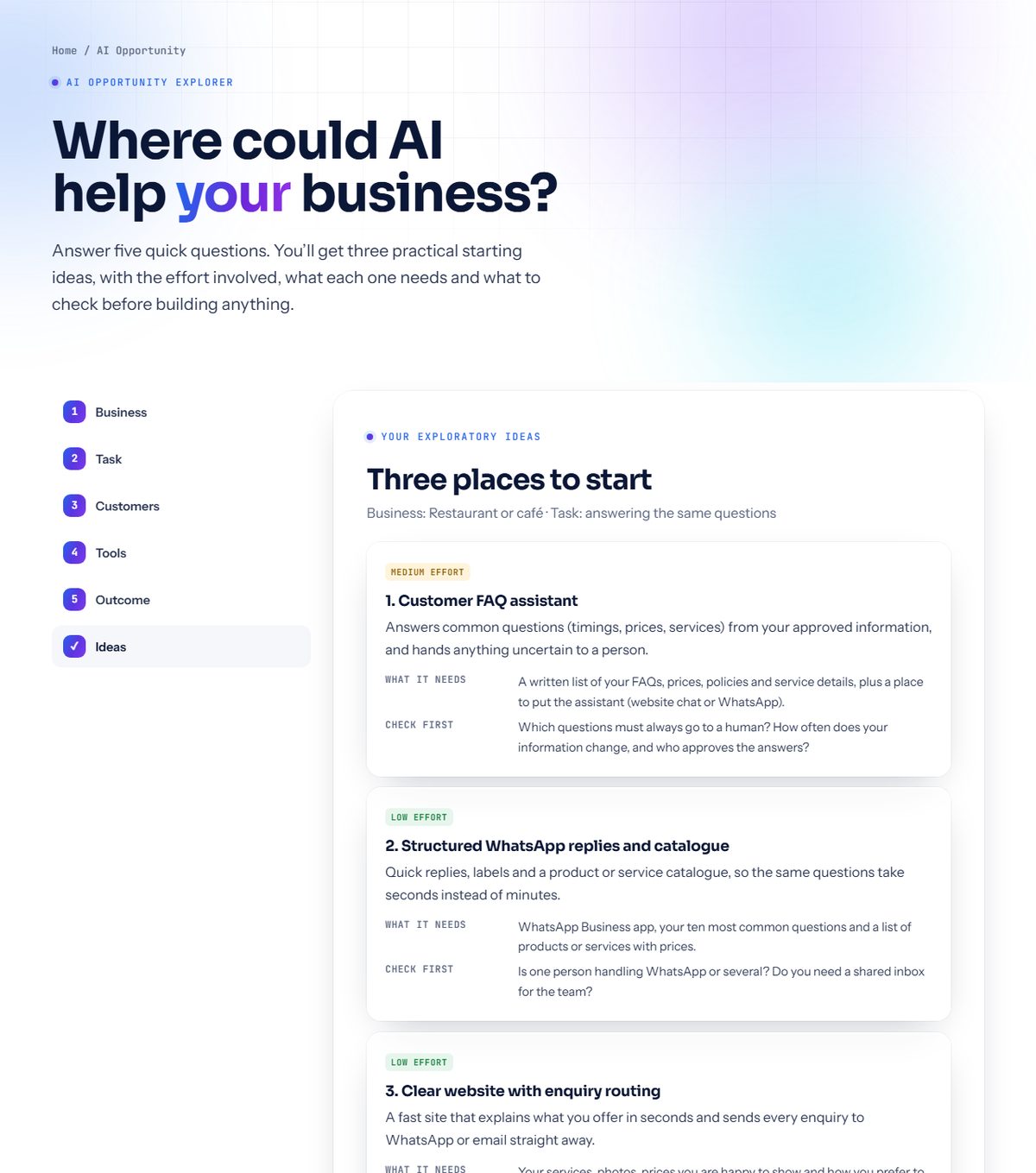 Internal Prototype
AI Opportunity Explorer — guided idea finder
Five questions about a business return practical AI and automation ideas, effort levels and what to check first.
Want something like this for your business?
Tell us what you have in mind. We’ll explain what a first version could look like, honestly and in plain language.